
RESPONSIBILITIES
Shaping the premium homepage shopping experience
Vision & Strategy
I helped conduct discovery workshop to understand the founder’s vision and needs for their homepage.
Design
I created wireframes that strategically balanced immediate product access with essential brand storytelling to build credibility for a new company.
Visual Identity
I redesigned the visual style to align with Bamboostan's new premium e-commerce identity, carefully preserving the core essence of their original branding.
Development & Quality Assurance
I collaborated closely with developers during implementation and conducted thorough QA testing to ensure the final product perfectly matched the design vision.
THE PROBLEM
A premium vision trapped in a basic template
Lacked E-commerce Identity
Their old website felt more like a hobby project than a serious online store. With only four products buried among many other sections, it didn't look like a proper e-commerce site.
Mismatched Branding
The existing template failed to convey the premium, sustainable brand image that their high-quality products truly deserved.
Trust & Discovery Deficit
As a new sustainable brand, Bamboostan needed to establish trust with customers while simultaneously making it easy for them to discover products and drive sales—something their current site didn't facilitate.
Subpar Product Images
Existing product photography featured busy backgrounds and poor composition, which directly undermined the premium positioning they aimed to achieve.
WEBSITE NEEDS
Maximizing product exposure and premium visual appeal
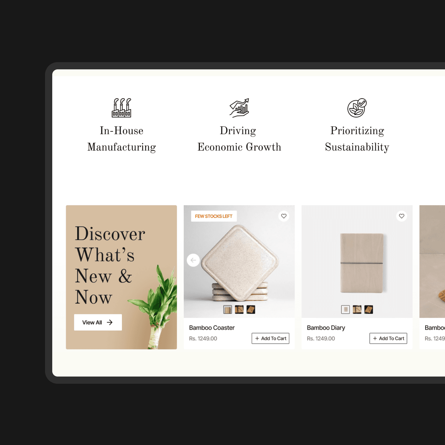
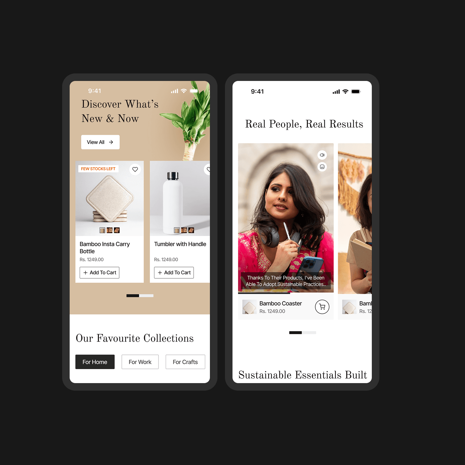
Homepage Product Showcase
They wanted to display a wide range of products directly on the homepage, allowing users to discover offerings without navigating to separate product listing pages.
Immediate Sales Focus
As an emerging brand, the priority was to drive immediate sales, emphasizing products over extensive brand storytelling or mission/vision content that might divert from purchasing.
Sophisticated Aesthetic
The website needed a sophisticated and classy design to align with their target audience – the top 3% of Indian earners – matching their premium price point and customer expectations.
Flexible Product Management
They required a flexible system that would allow them to easily swap and rearrange product sections as their inventory and business priorities evolved.
WEBSITE DESIGN
Leveraging e-commerce best practices for intuitive discovery
With just a 24-hour deadline for wireframes, I focused on understanding the core principles of successful product-focused e-commerce sites. My design approach was informed by analyzing industry leaders like Target, Walmart, and IKEA, specifically how they:
Diverse Product Presentation
These sites showcase products in multiple ways on the homepage, going beyond simple grids. This caters to various user shopping behaviors and preferences.
Strategic Discovery Paths
They create numerous routes for product discovery, including featured collections, trending items, and category- or lifestyle-based sections.
Personalized User Experience
By offering these varied presentation styles, these brands allow users to gravitate toward the display that best matches their shopping mindset, enhancing the overall experience.

Structuring the homepage for engagement and sales
My wireframes were meticulously crafted with strategic sections, directly addressing Bamboostan's business needs and insights from competitive analysis:
Diverse Product Navigation
I incorporated direct category navigation for decisive shoppers and a prominent three-product hero section, balancing visual appeal with immediate product discovery.
Enhanced Social Proof
I designed a "Most Beloved Products" section, featuring enhanced shopping functionalities, to leverage social proof for hesitant buyers.
Brand Credibility & Trust
I integrated clear USP highlights throughout the wireframe to effectively build brand credibility and establish trust with new users.
Multi-faceted Product Discovery
I created multiple product discovery sections, from "Discover What's New" for novelty seekers to "Favorite Collections" organized by lifestyle use cases, catering to various browse preferences.

Overcoming other hurdles during the project

Achieving the premium aesthetic
The Challenge
Bamboostan's original bright pale green brand colors clashed with their aspiration to be perceived as a premium, sophisticated brand. This color scheme simply didn't convey the desired level of elegance.
The Solution
I shifted to a neutral color palette, integrating rich bamboo-inspired browns and blacks, while strategically retaining subtle green accents. This approach allowed the products to take center stage, aligning with the restrained elegance typical of premium brands and successfully transforming their visual perception.
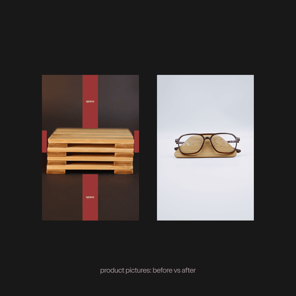
Transforming images for the premium appeal
The Challenge
Subpar product photography, with distracting backgrounds and poor composition, directly undermined the sophisticated, premium image we aimed to create for the brand. It would have cheapened the entire look and feel, regardless of the design.
The Solution
I provided product photography guidelines, emphasizing 'product in use' shots, the strategic use of white space, and professional lighting. This was crucial, as high-quality product imagery is the primary selling tool in e-commerce, directly dictating the perception of a premium brand.

Adapting font for shopify's limitations
The Challenge
We chose a unique, elegant font combination. However, Shopify's platform doesn't easily support custom fonts, meaning our chosen aesthetic couldn't be directly implemented. This barrier risked undermining the sophisticated look.
The Solution
I quickly pivoted to Google Fonts alternatives, ensuring the design could be properly implemented. This experience highlighted the critical lesson of verifying technical constraints before finalizing any design decisions to ensure practicality and effectiveness.

Balancing design with core functionality
The Challenge
Our decision to custom code Bamboostan's homepage for a unique look had an unintended consequence: it inadvertently disrupted standard Shopify features like real-time cart feedback and wishlist integration. This directly hindered essential user interactions and created a negative experience.
The Solution
While I designed and implemented a quick button-state fix, it wasn't an ideal long-term solution. This experience taught me a crucial lesson: the pursuit of visual uniqueness can sometimes harm core user experience. Any custom solution must offer substantial value to justify potentially breaking built-in platform functionalities.
METRICS
The metrics that I wished I could have tracked
To validate the success of the new design, I wish I could have tracked key metrics directly aligned with Bamboostan's business objectives.
Product Exploration & Engagement
Did the product-heavy homepage successfully encourage users to discover and explore a wider range of products?
Conversion Rate
Had the "Add to Cart" rate significantly increased, indicating improved product appeal and user journey effectiveness?
LEARNINGS
Hard-learned lessons from our first shopify project
Product Photography is Paramount
I learned that even the best design can't compensate for poor product images. High-quality product photography is non-negotiable for e-commerce success, and I now integrate content quality discussions into the early design phases.
Balancing Customization and Platform Functionality
This project highlighted the critical trade-off between achieving a unique custom design and maintaining a platform's built-in functionalities. Over-customization can inadvertently harm crucial e-commerce features and conversions.
Prioritizing Technical Discovery
I now understand the absolute necessity of researching and understanding platform limitations (like Shopify or Webflow) before beginning any design work. This ensures design decisions are technically feasible and prevent last-minute pivots or broken features.