PROJECT OVERVIEW
Empowering stock brokers with AI driven analyst insights in a chatbot
Financial Services
AI
A major bank’s securities division wanted to boost the number of transactions, but their stock brokers were hindered by inefficiencies in workflow especially when they work in high pressure environments.
We designed an AI-powered chatbot that seamlessly integrates into their existing platform, instantly processing hundreds of research PDFs, analyst calls, and market reports to deliver quick, relevant answers aiming to reduce search time for information from minutes to seconds with the help of AI.
Timeline
August 2024 – September 2024
Team
Product Designer, Project Managers, Development Team
Responsibilities
Research, Concept, Wireframes, End to End Visual Design

Default chatbot screen with research summary widget

Order placement in left panel

Quick actions access popup in chat input
KEY RESEARCH OBSERVATIONS
Understanding and observing stock broker workflows
Our research phase was instrumental in uncovering the root causes of stock brokers inefficiency. Through contextual field visits to observe live work environments, in-depth interviews, and detailed workflow analysis, we identified who these stock brokers were and their key behavioural patterns and environmental constraints.
Meet Raj; our resident stock broker
Raj Shah operates in a high-pressure, fast-paced, and noisy desktop environment, primarily driven by keyboard interaction. His main goals are to quickly find key insights, identify opportunities, and enhance client conversations to successfully increase transactions.
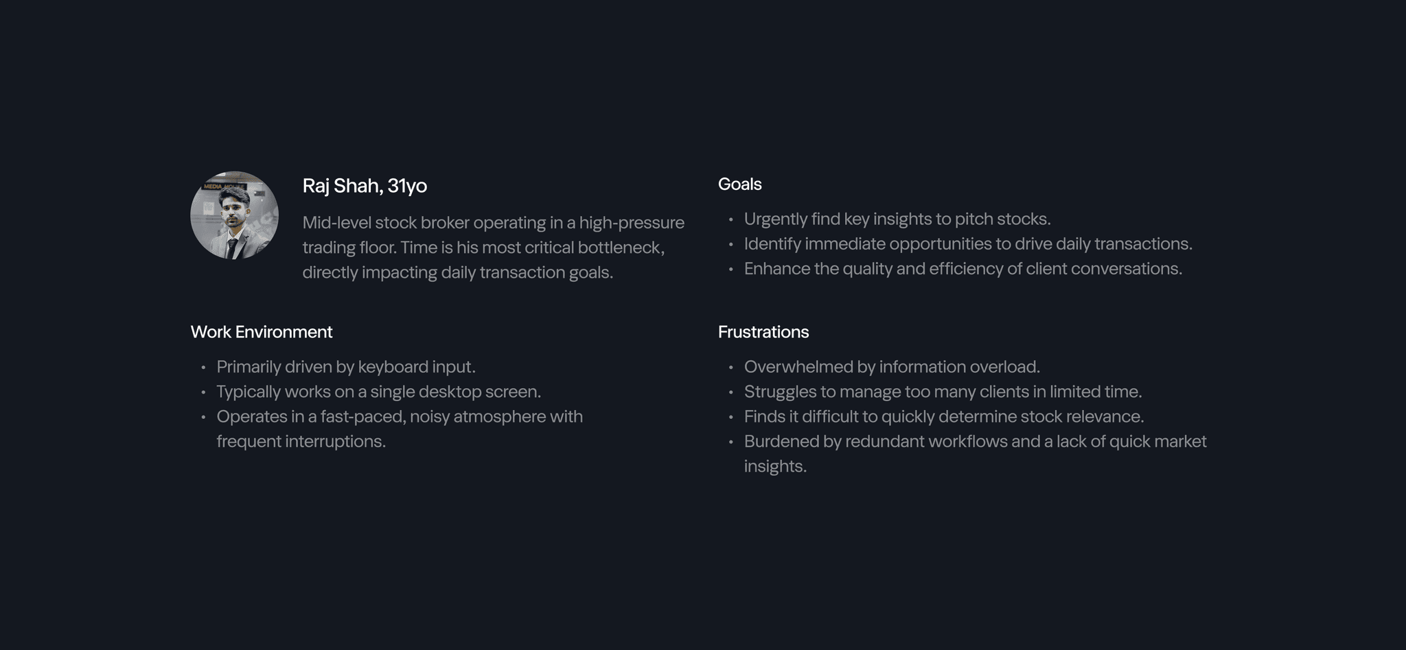
Raj's frustrations and work environment
Raj's Workflow
Our observations revealed Raj’s workflow was burdened by constant context-switching across multiple platforms, relying on manual client tracking, and a tendency to bypass internal, lengthy research for quicker, external tools.
This fragmented and inefficient process was the primary bottleneck hindering daily transactions. This solidified that an integrated, AI-powered solution was not merely an improvement but a fundamental necessity for operational transformation.
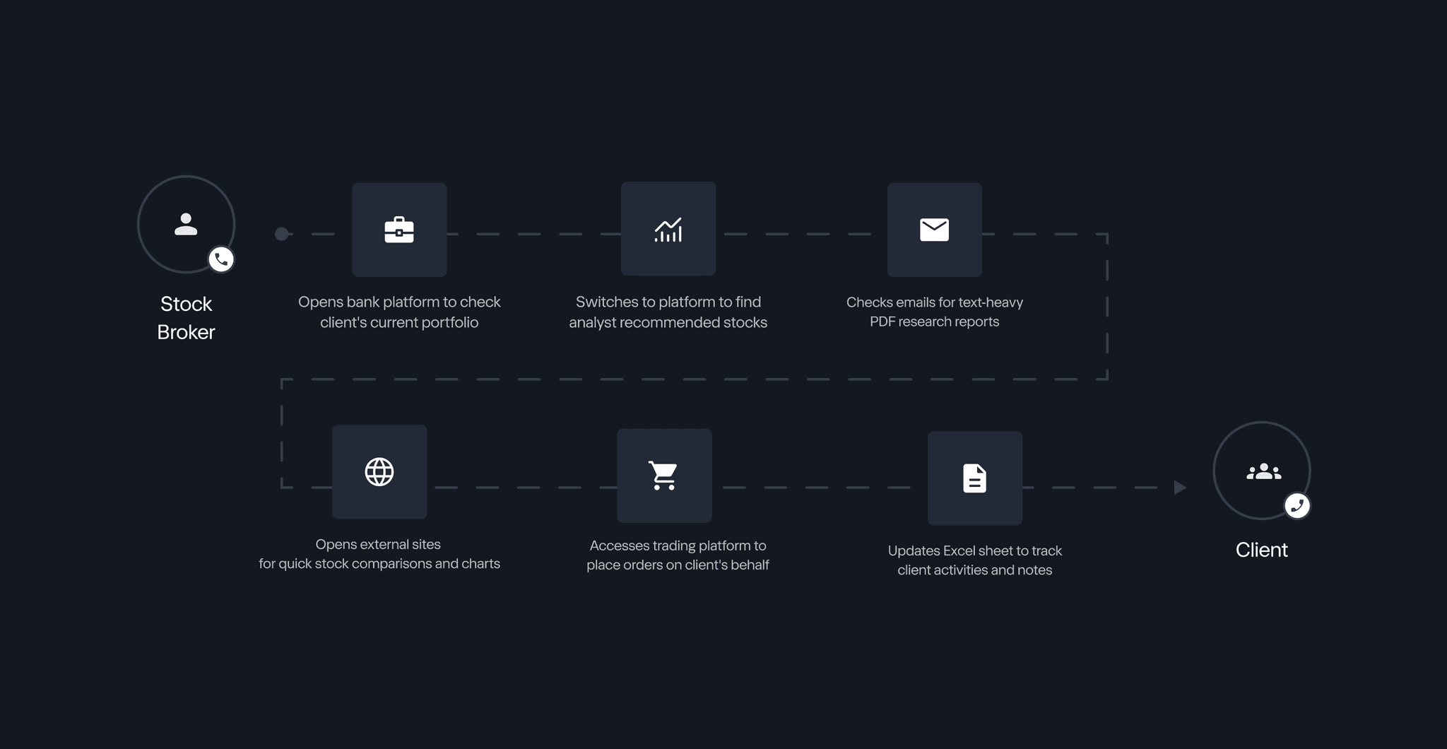
Raj's most common workflow when on a call with a client
CORE PROBLEM #1
Brokers were drowning while juggling 5+ screens at a time
Brokers constantly switched between 5-6 different applications or screens just to gather all the information needed for a single client interaction. This "screen juggling" included checking client portfolios, pulling up internal research, sifting through emails, looking at external financial sites, and navigating trading platforms.
This constant switching created delays, increased the chance of errors, and was incredibly exhausting for them, slowing down their daily transactions.
SOLUTION #1
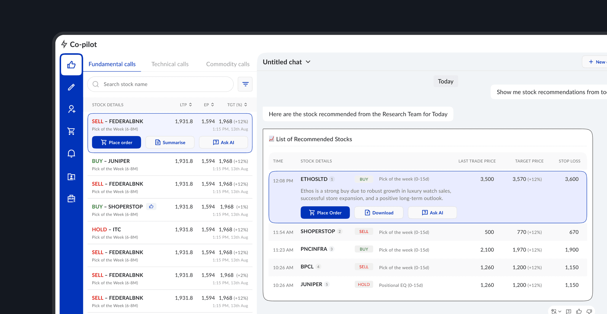
Left Panel — A Control Hub for Actions
This panel gives quick access to important everyday tasks that don't involve the AI, such as viewing stock recommendations, creating notes, managing client lists, creating buy/sell orders, and checking notifications. By integrating these key tools, it helps consolidate the dealer's workspace and minimizes the need to jump to other applications.
This ensures that brokers have all necessary information and tools within a unified platform without disrupting their main workflow. This allowed the left panel to serve as a complementary action space to the main chat panel, making it both customizable and scalable for any future features.

The left panel consolidates all the workflows brokers previously managed individually
CORE PROBLEM #2
Brokers faced too much information with not enough time to process it.
Dealers were drowning in vast amounts of internal research, like long PDF reports from their own analysts. It was nearly impossible to quickly find the specific pieces of information they needed during fast-paced client calls.
Because finding relevant insights in their own in-depth research was so difficult and time-consuming, brokers often resorted to using third-party websites for quick answers, even though these external sources might lack the depth and specific context of their bank's valuable in-house analyst reports.
Solution #2
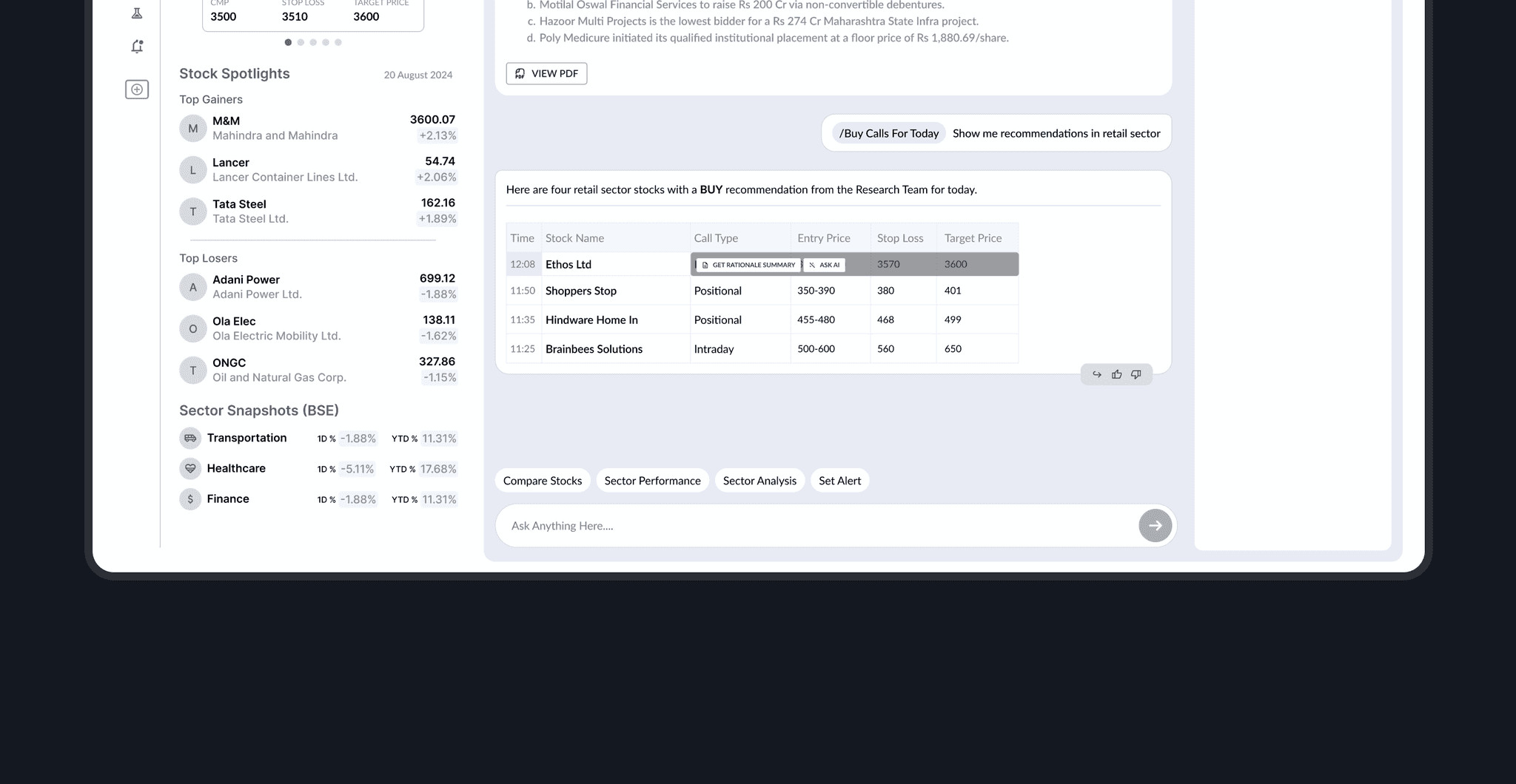
Central Panel — The Interactive AI Chat
This central area lets dealers ask questions about stocks. The AI quickly pulls answers from hundreds of research reports, even learning from feedback to give better replies. It shows key info like charts and lists instantly, drastically cutting down information search time by making internal research easily searchable and digestible.
Right Panel — Transparency of Source
This panel shows the exact sources for every AI answer. Dealers can quickly see and even download the original research PDFs. This ensures they can trust the information and easily share their bank's valuable analyst reports with clients.

Central panel using AI to simplify research for the stock brokers
INTERACTION PROBLEM
Designing for keyboard first users
While on wireframes, we realised that we needed to have an interaction pattern that would allow additional information and action items to be shown progressively to ensure the screen was focused on the key information.
We explored few very obvious hover state interactions to be able to show action items in stock lists, but it was then we realised that one of the important observations we saw was that these stock brokers were incredibly fast, keyboard-first users, relying on muscle memory and shortcuts.
It meant that traditional mouse-centric interactions like hover states that we were exploring would hinder their speed and disrupt their habitual flow. I took on that challenge to ensure that our interaction pattern was something these brokers could use without interruption.
One of the first iteration ideas we had for hover state interactions
For my research, I looked beyond typical web platform designs and researched on how information is displayed on interfaces with limited buttons i.e. remotes and TV apps. Through this I noticed a consistent pattern of information revealing itself when an item is selected or in focus.
Applying this principle, I designed our components, widgets to progressively show additional information which became the most important interaction pattern on the platform allowing stock brokers to navigate it much smoothly.

Netflix using the pattern of showing additional information while on selection. Image taken from Google.
Using the similar interaction pattern to our platform
Central panel using AI to simplify research for the stock brokers
EDGE CASE
Designing for multiple stop loss and target prices in an edge case
Months after, the design hand off was done, the client came to us with an edge case. We needed to display multiple "stop loss" and "target price" values for a stock on a single card without expanding it horizontally.
I explored every possible solution, from the most straightforward to the most unconventional. When presented to the client, I was told that these numbers had to be immediately upfront and visible, not hidden. They also needed to be clearly related to the main stock card as alternate values.


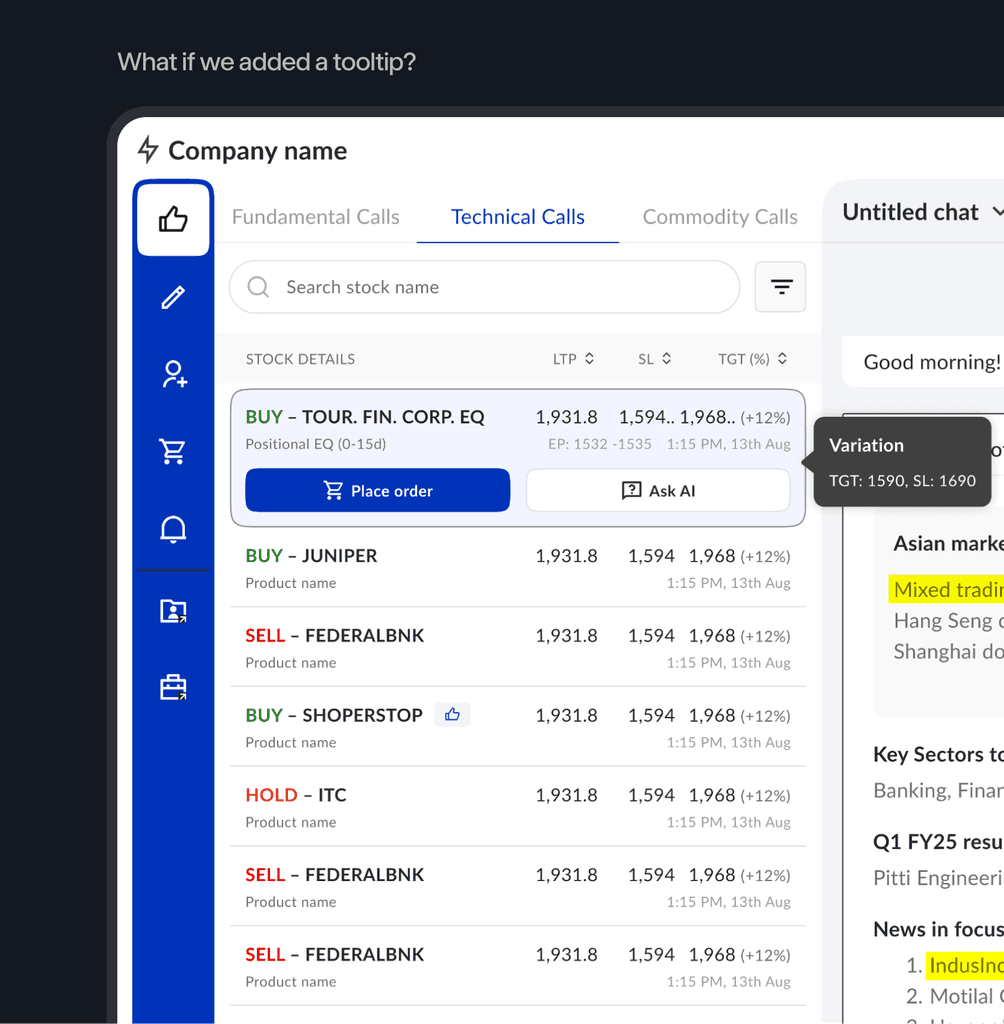


The concept that finally clicked was when I was exploring the "baby card" idea. What if we show it as a thread inspired by Gmail and Reddit? The threads that are on reddit where related comments or items are nested in a visually connected, yet distinct, manner. So I tried to replicate this threading principle.
This threading solution proved ideal as it fulfilled all key requirements:
1. Numbers were displayed upfront.
2. Visually related to the main stock card.
3. Did not break the design horizontally.
4. Provided flexibility to add multiple variations without visual clutter.
While the client initially had reservations because they thought the stock brokers won’t understand it, they agreed to proceed with it for User Acceptance Testing (UAT) and get back if it didn’t work. It has been more than six months and I haven’t heard back yet (fingers crossed!)

Inspired from Reddit

Final iteration
METRICS
The metrics that I wished I could have tracked
To validate the success of the new product, I wish I could have tracked key metrics directly aligned with the business objectives.
Did the platform reduce app switching and improve response times for client queries?
Decrease in platform/app switching per client interaction.
Average response time from client query to dealer recommendation.
What were the daily active dealer rates, and were they retained over time?
Daily Active Users (DAU) / Monthly Active Users (MAU).
User retention rates (e.g., % of users returning after X weeks/months).
Feature utilization rates (most/least used widgets).
LEARNINGS
Hard-learned lessons from the project
User-centered design approach
On-site observation of dealers profoundly shaped our design, revealing critical insights like their keyboard input preference (due to noisy environments) and the necessity of real-time chatbot access during client calls.
Design what you can define
Early on, guided by our CEO, I learned to focus on designing definable chatbot states (e.g., default view, common widget outputs) rather than attempting to design for infinite conversations. This provided a solid foundation before tackling edge cases collaboratively with development.
Allow buffer time in project planning
With a tight four-week deadline for over 50 screens, this project underscored the crucial need for adding extra buffer time (1-2 weeks) in project plans to accommodate feedback cycles and approvals, which often extend beyond initial estimates.
Inclusive collaboration from the start
Involving all relevant parties, especially the development team, from the very beginning for early feedback and feasibility checks, proved invaluable in shaping the product, minimizing miscommunication, and streamlining development.